Higher Education · Brand Development · Direct Mail
Fairleigh Dickinson University
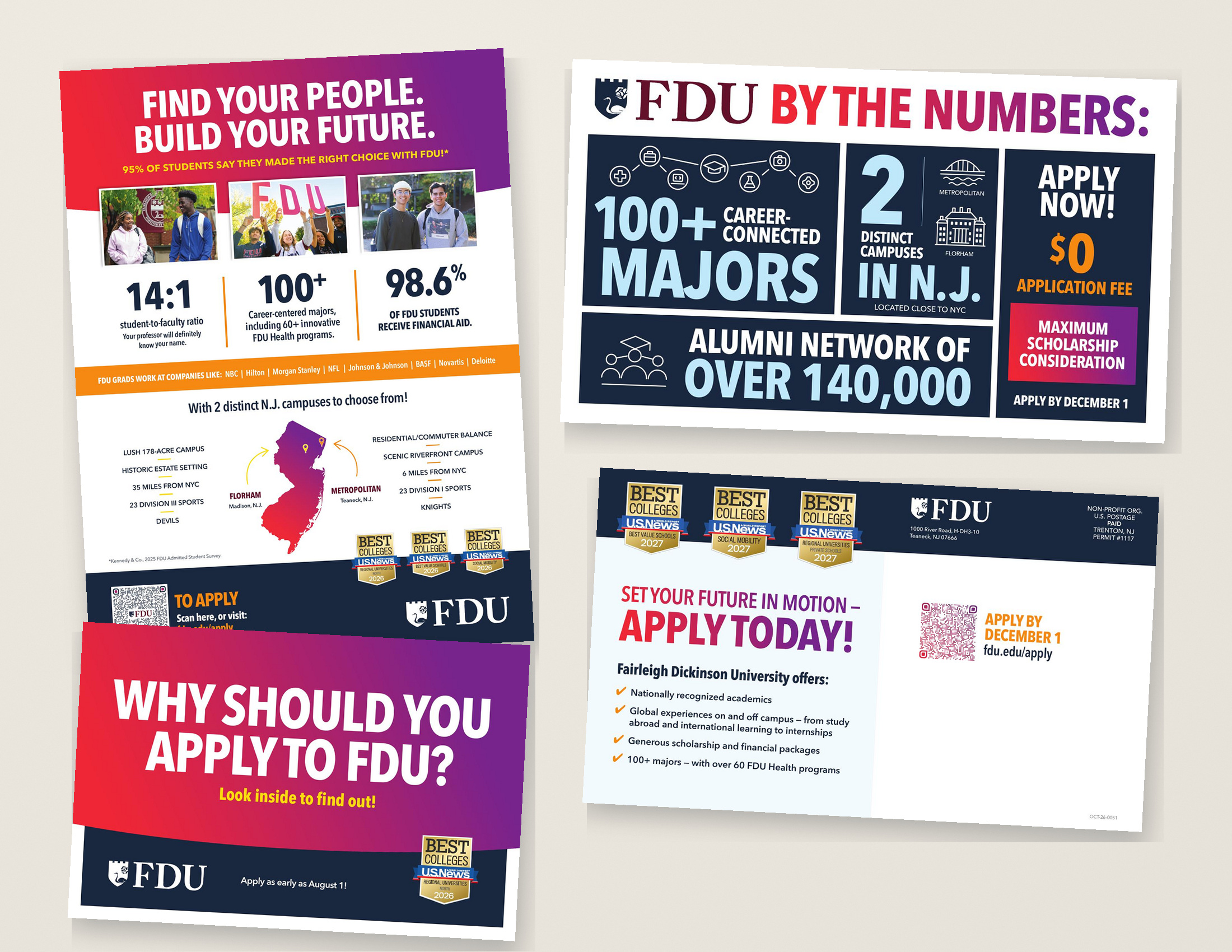
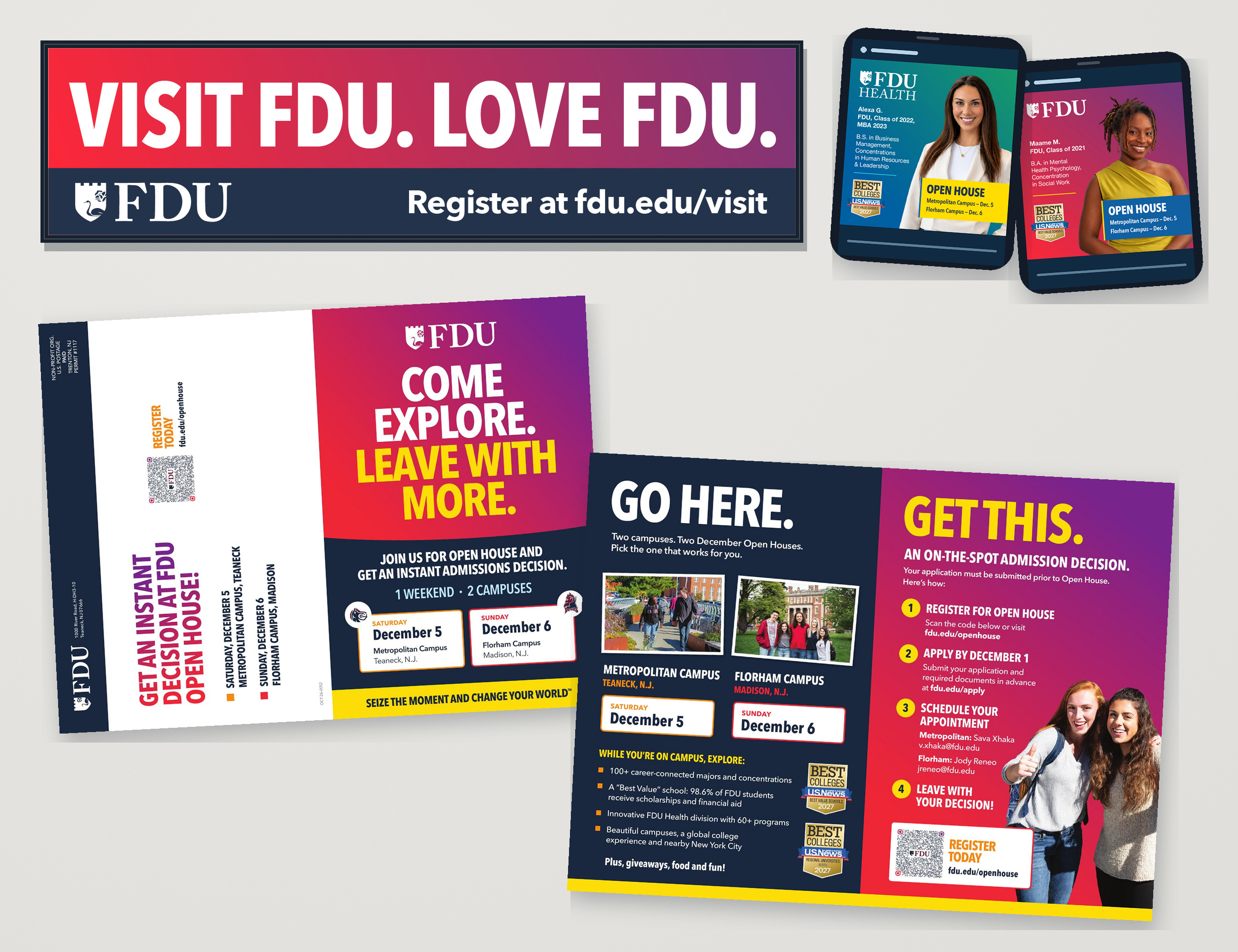
As the creative lead for Fairleigh Dickinson University’s admissions and recruitment marketing initiatives, I’ve recently helped evolve the university’s branding into a more vibrant, energetic, and playful visual direction. Bold colors and dynamic gradients bring fresh personality to the work while creating a clear distinction between FDU’s core academic programs and FDU Health.
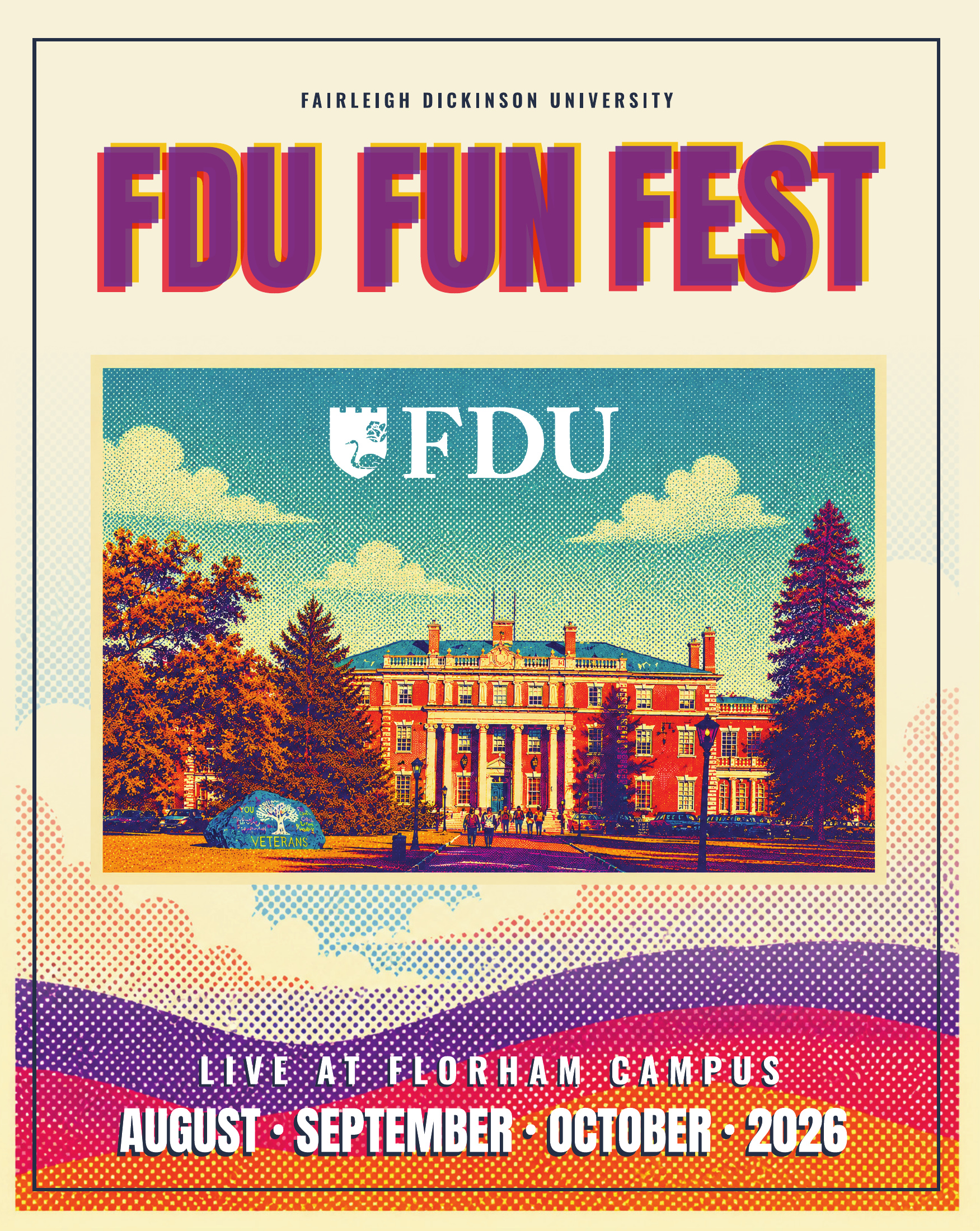
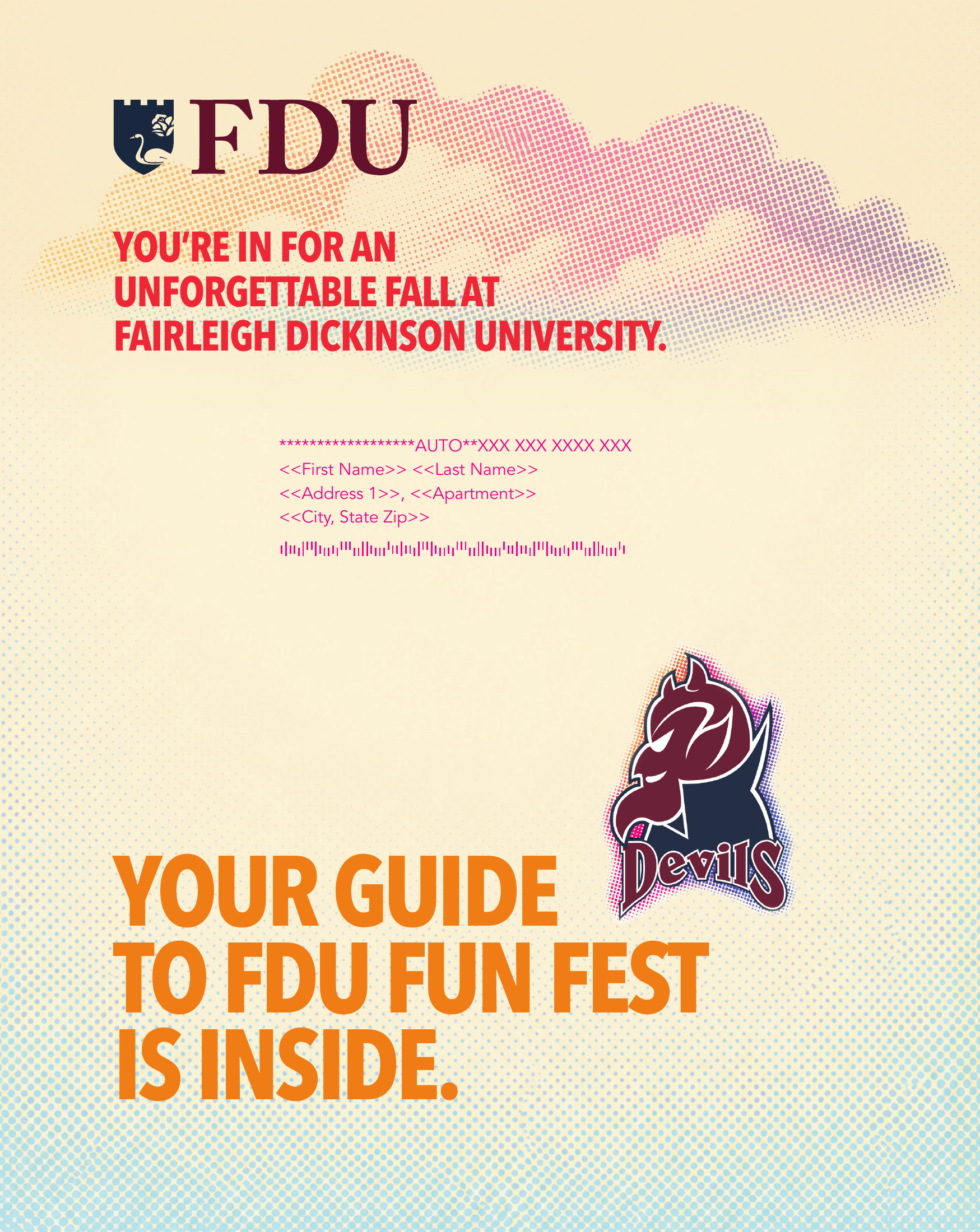
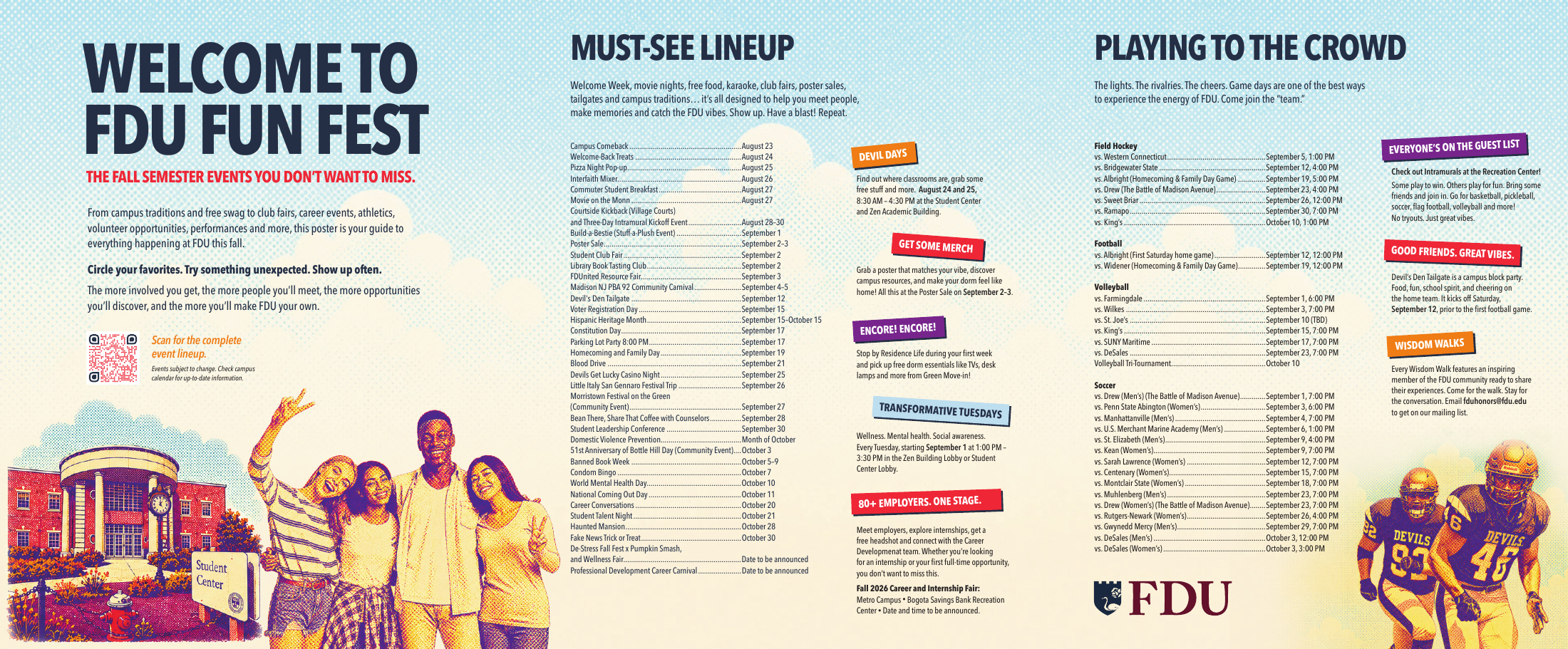
The welcome-back mailer brings that same energy to student life. An 8 × 10-inch piece opens to reveal a three-panel event guide, then unfolds into a full 20 × 24-inch poster, transforming a functional mailer into an engaging, interactive experience.
- Client
- Fairleigh Dickinson University
- My role
- Recruiting + Admissions Marketing Brand Development + Design
- Brand direction
- Energetic + Colorful Core Brand + Health Programs
- Featured piece
- Welcome-Back Mailer 8 × 10 inches closed 20 × 24-inch poster
01 — Welcome-back mailer
From mailer to poster.
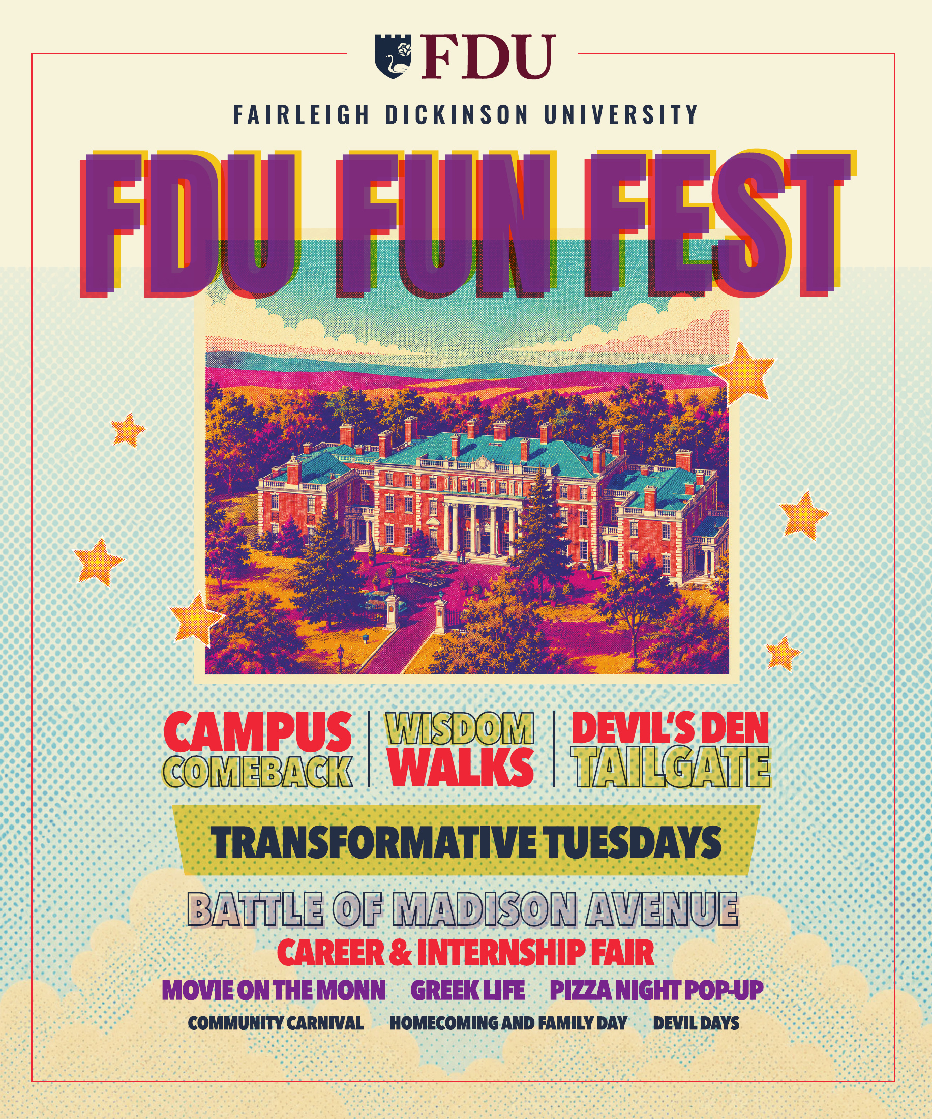
Inspired by old concert posters and halftone dot printing, the final poster gives the campus event lineup the energy of a live-show bill.
8 × 10 inches · Closed cover
06 — Admissions campaign collections
A connected family of work.